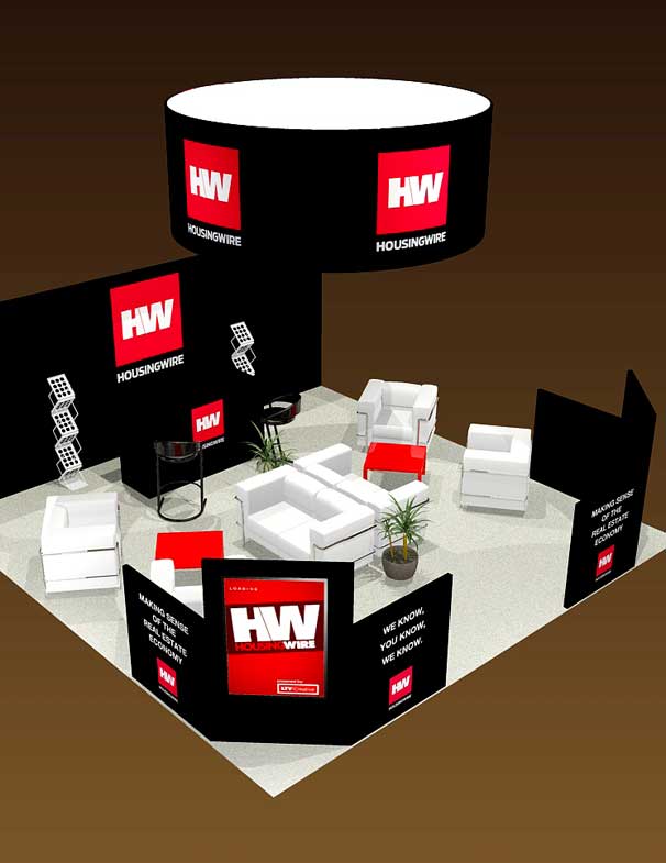
Exhibit Signage = Engage and Sell
Like a bookstore full of books, a trade show is a sea of exhibits, each clamoring for attention and sales. Most signage is not effective enough to be noticed from across a large room because of poor design execution. Here’s how you can turn your exhibit signage into a visual magnet—drawing people in—without looking garish or unprofessional:
1. Logo & Message. Make sure your logo and tagline are large and bold, and includes a photo of your product. This is the first hierarchy of visual messaging. The second hierarchy could be 3 bullet points below that answer the question, “Why should I buy your product?” This will be visible from 10-50 feet away, and will help reel in the audience.

2. Color. Your exhibit is competing with everyone else’s exhibit. A trade show is a visual overkill, and you want yours to stand out as a beacon—but convey success and style. Contrasting colors of text/graphics work best—you can always try white on black for simplicity, or try color combos like orange/blue, yellow/purple, red/green. Always be consistent: Your logo should match your general color scheme.
3. Finally, your font. Fonts are powerful in themselves; they are the “tone” of your message. Our recommendation: Avoid seriffed fonts. These are good for reading books or newspapers, but generally do not work well in signage, and can be difficult to read from afar. The same goes for script or ornamental fonts which are very difficult to read from a distance. Stick with san-serif font families like Arial, Gill Sans, Helvetica Bold, Futura, or even Impact for a really bold look.
Remember, communication is key, and applying the right look to your signage is crucial. Make that first impression count! Contact us.
